Your marketing to education partner
Expand your education network
Reach 645,000+ teachers and decision makers.
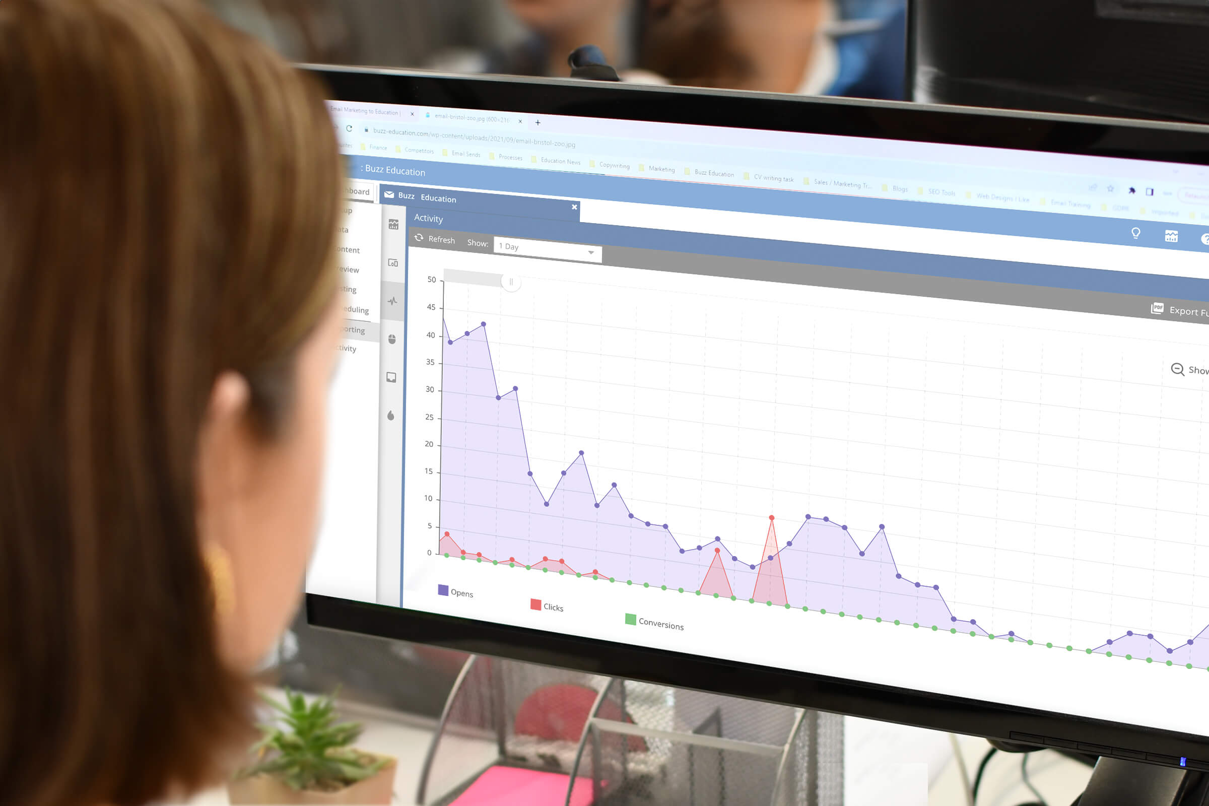
Boost your engagement rates
Top tips from our education marketing specialists.
Generate leads with confidence
100% GDPR compliant & 99% data accuracy.
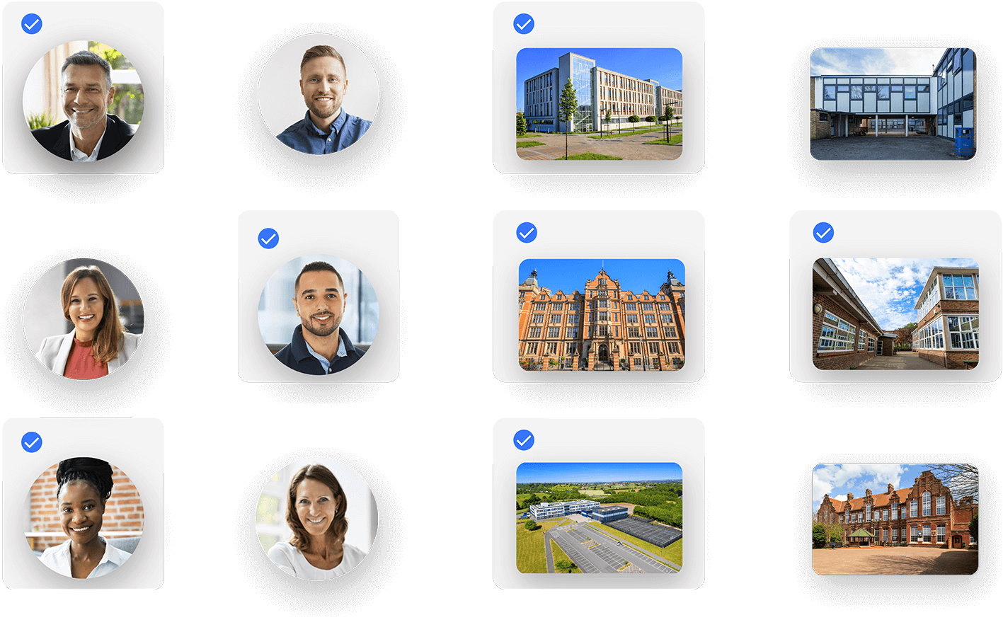
Trusted by 2,000+ education suppliers, organisations & businesses worldwide


Here’s what we do:
Coordinate your own multi-channel marketing with a custom-built database.
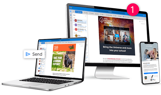
Generate guaranteed leads with direct email campaigns to your target teachers and decision makers.
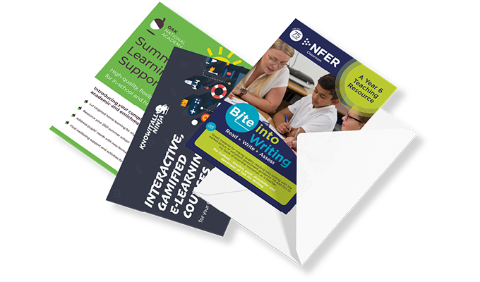
Make your mark in UK schools with a stand-out postal marketing campaign.
WHO WE ARE
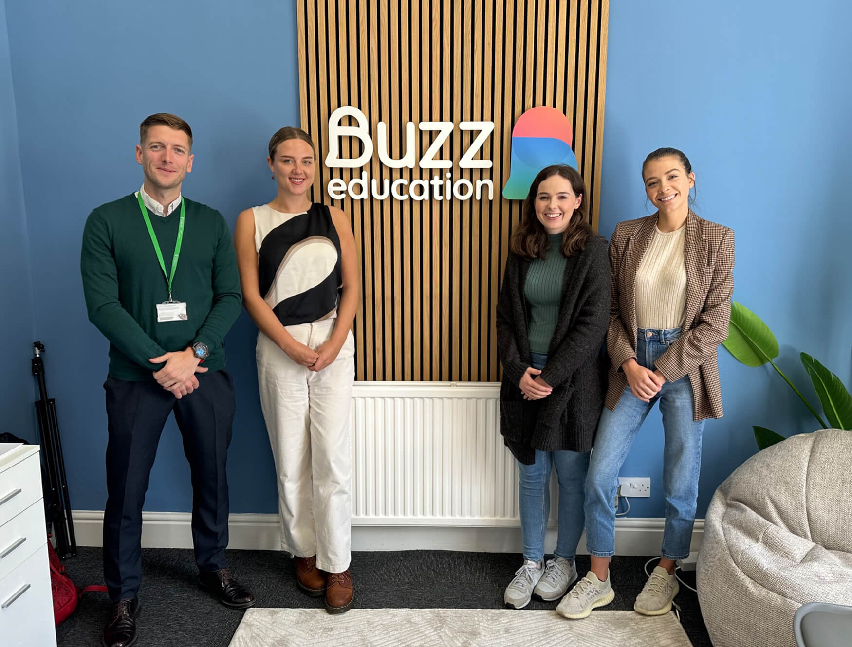
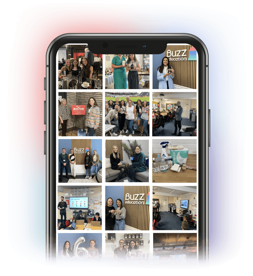
Your dedicated team of marketing to education experts
We’re a friendly team of education marketing experts here to help you generate leads and build long-lasting relationships in the education sector.

49,232
UK schools and education establishments we can build your brand in.
645,158
Teachers and decision makers we can help you connect with.
134
Education job roles you can include in your tailored marketing list.
The proof is in the partnerships
Building trusting relationships with our clients and helping them achieve amazing results is at the heart of what we do.
“Such a pleasant experience and a massive help with our campaign! The team has been wonderful with meeting all of our needs, with prompt responses and a friendly manner.”

“The team were so quick in getting back to me with a full email plan. We had a chat over the phone and they made it easy to book. Highly recommend the team for their quick and friendly service.”

“The team has been incredibly helpful throughout our campaign – the quality of service has been fantastic! They’ve been a pleasure to work with and have made the process very easy.”

“I would 100% recommend Buzz Education. We get really strong results from our campaigns – on the day of send, our inboxes are filled with enquiries coming in thick and fast!”

“Buzz Education deliver great campaign results and are a pleasure to work with. They’re always quick to respond and answers any questions we have!”

“Excellent service. The staff are always ready to help, they’re professional and do outstanding work. Highly recommended.”

“We’re pleased with the results. They’ve been extremely helpful with tips and constructive comments. We’ve previously used other suppliers and can only say it’s shame we didn’t find Buzz earlier.”

“Fantastic customer service – I always get a response within a few hours and our mailings have always generated a good response too.”
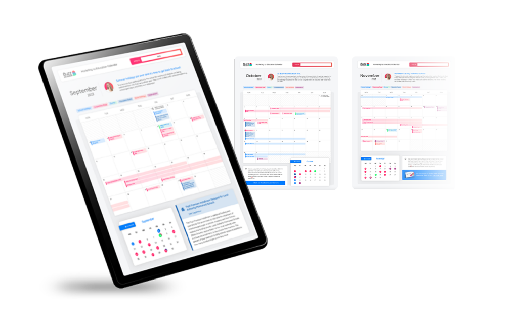
ACADEMIC YEAR 2023-24
Marketing to Education Calendar
Plan and organise your marketing for the 2023-24 academic year with our Marketing to Education Calendar.
Buzz does more than marketing to education. We care about doing our bit. Not just for the education sector, but for the environment, our local community, and future generations.
Recent articles